Yesterday (or so), Apple updated their full iWork suite, previously only available for iPad, so they are now universal applications available also for iPhone and iPod.
At first my reaction was like "oh wah marvellous", and proceeded to do the update as soon as my internet connection allowed it.
While I don't use Keynote or Numbers in my iPad (indeed I don't use Keynote in any place), I do an extensive usage of Pages for iPad, almost daily, as a place to continue my writings while I wait on medics, public services, so on.
The application shows excellent programming and designing skills, having the exact same interface and features as the iPad version, but that's all folks
The iPhone is simply too small for it.
When you are in the editing mode, as seen in this screenshot
You only see a very very small part of the document, less than 10% vertically and 25% horizontally if the page is configured to DIN A4. Indeed you almost see more borders than text.
And in contrast with the iPad version, you cannot rotate the device to gain horizontal space, you're constrained to that dimensions.
Also in this orientation the iPhone keyboard is too small to be comfortable, specially if you plan to write continually, as I do for hours.
In the viewing mode
By default it will adapt the whole page to the iPhone's screen, making the text small, really small.
This is not so of a problem if you have good sight and the Retina Display, as the text is still readable.
But you won't want to do that.
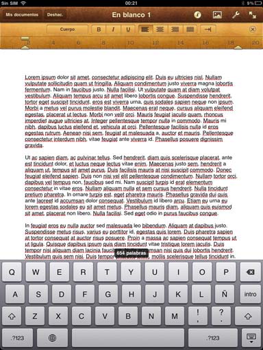
Compared to the iPad screen
Where in the editing mode and portrait orientation you can still fully use the keyboard, see a good portion of the document to be in-place.
And in the landscape orientation, the writing becomes almost as comfortable as a real computer.
Conclusion is, Pages for iPad is a great writing application, but Pages for iPhone is just an application to do occasional editing on last times.


No comments:
Post a Comment