On 10th June 2013, Apple introduced the next major revision of their Mac OS X operating system, 10.9, and stopping with the tradition of naming them like big felines, this one gets called "Mavericks" like the surfing location on the state of California.
First impressions
At a first glance it seems that the design is being flatted a little, like what is happening to iOS 7. It's not as radical, there is still that metal theme along all the system, but for example, now the login screen has a single flat background color, and you can also notice it on the dock and the System Preferences window.
Maps
In last year's iOS iteration, Apple decided to break free of Google and put their own mapping solution. And this resulted in an ill-fated situation with an insanely high number of users complaining about the maps quality. In my own experience, it's as good as the others, and this means, all mapping solutions have huge errors. But I clearly welcome the change, as Google solution was limited compared to what they offered on other platforms, limiting the experience and putting Apple devices in a disadvantage.
This new Mac OS X iteration brings the Apple maps to the desktop, and while having the same errors (and corrections, because the maps are corrected server-side), it seems like a good idea.
While most of the times you will need the maps while on-move, you will also set routes, and search for places, in your desktop. And Apple though about that. You can share your share or route via Messages, saving it as a PDF, or, sending it to your iCloud-connected iOS device, so you just take the device, unlock it and start following Siri's driving directions.
Or walking! Because they also added support for walking directions (present also in iOS 7).
And finally you can get business information shown in separate windows with photos, open hours, so on, taking this information from Yelp. But for some strange reason, even if in all the places shown in the previous screenshots there are plenty of places registered in Yelp, it seems this functionality only works in the US.
What I miss from this application is the ability to download offline copies of the maps to be used internet-less and the support of GPS dongles, something that is easy to add and will make it useful for traveling people.
Calendar
Another place of visual overhaul is the Calendar application. No more trying to imitate a real-world one, it returns to the basics, showing a flatter interface with pastel colors that resembles Mac OS X 10.5's.
One of the simplest but most "why wasn't this here before" features is continuous scrolling. Using the touchpad you just scroll and scroll and scroll until you arrive the date you were searching. Simple, but powerful.
Another feature is the integration with Maps,
so you can add a place based on the real location, and see at a glance a minimap, and if near enough, a weather forecast (from Yahoo Weather).
Also you can use the travel time, knowing the exact location, from your current location. Only from your current location. Quite a limitation considering that you maybe going two places, one first, then the other, without returning home.
Also Facebook events will appear here.
Safari
Under the hood Safari gets faster, less memory hungry, and over the hood, it gets a "Shared links" feature.
"Shared links" shows you in the sidebar (while Apple says it's new, it was already there with Reading List, it's just got new features) all the links posted by the Twitter users you're following. Not a heartbreaking feature, but I find it quite useful.
You can also get a password generator for sites you're registering, that automatically saves your freshly created hard-to-remember password in the keychain. And from the keychain it can take and fill all the credit card data, but the verification code.
iCloud
iCloud's only new feature is the iCloud keychain, and yet it's not new. It was already present in MobileMe.
At least this time they're making it more secure. Instead of plainly syncing your keychain with any device that gets added to your iCloud, it will request authorization to an already existing device, or via SMS, or the newly added device will not get the keychain.
Multi-display
Not kind of a feature but a "this is how things should have worked", they corrected the ugly "feature" that blocked all but one of your displays in a multidisplay setup as soon as you were using a full-screen application from Mac OS X 10.7 onwards.
Also you can now use your Apple TV connected television not just as an AirPlay Mirror, but as another display.
Finder
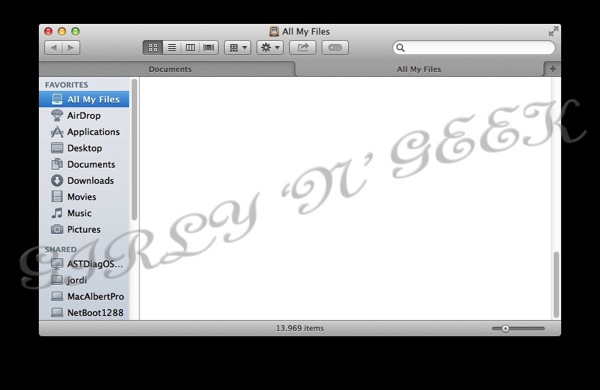
Finder gets tabs, something power users like me will definitively like.
You can use tabs to have origin-destination windows for copying, to have all the places where a project's files are located opened in a single window, and you can drag&drop to the tabs themselves.
The other new Finder feature, is not exclusive to it, but a system-wide feature that gets easily managed thru Finder: Tags.
While at first glance it seems just like the good-old labels, things are only similar.
Tags are infinite, freely-named, labels. You can name them the way you want, assign a color, search for them in Spotlight, or you can create a Finder tab showing all files in the computer with that tag. And if you drag&drop files to the Tag window, all that files will receive that tag.
Last but not least, a file can have multiple tags at the same time.
Server
I've not been able to test Mac OS X Server 10.9 extensively, but it also doesn't have much to say. They add support for iTunes Store and App Store (the iOS one) to Caching Server, that in 10.8 only supported the Mac App Store. This will make caching servers need quite a lot more of disk space for iTunes-intensive workplaces, and be a huge bandwidth saver for iOS-filled ones.
Also they add support for creating Xcode building farms, something that Xcode already had in previous versions.
They still have not returned the ability to be an Active Directory server that they took away in 10.7.
Advanced internals
Compressed Memory
A simple concept, compressed memory compress the inactive memory, that is the one that can be swapped to disk, just because that's faster than copying it to disk, and makes it faster to be copied to disk
App Nap
With App Nap, applications that are just sitting idle (no I/O, no sound) are slowed down, or completely stopped, to preserve battery.
Apple promises up to 23 percent less battery usage, but considering that the most battery hungry process is usually Spotlight, it's yet to see.
Timer coalescing
This is a more complicated feature. Instead of letting all applications request and do anything the time they want, creating a lot of spikes of CPU usage/idle times, Mavericks will group all applications usage of the resources (timers) so they go in big usage/idle pieces, allowing the CPU to idle more, and so, save battery.
Other features
Other features introduced in Mavericks is a minor rework of Activity Monitor, including a new Energy tab and new stats and graphs, privacy controls for applications requesting to control the computer for accessibility (not just a system-wide "allow all" or "deny all" but fine-grained by app), support for LinkedIn accounts, automatic installation of updates (take care with restart-required ones, as this will restart your computer and applications not yet enabled for the document saving feature introduced in 10.7 will lose their changes), "Enhanced Dictation" (that is, offline, continuous and realtime, without sending your voice to Apple but doing it all locally), OpenGL 4.1 (finally, but still outdated), don't-play-till-you-want plugin in Safari (Flash ads, say goodbye), interactive and web notifications (couldn't test as none appeared), better iTunes HD playback efficiency, full iBooks support (reader, store, server's cache, nothing appeared in Developer Previews 1 or 2), and not much else. Oh, wait, yes, a heavily modified, color-changed, wallpaper of a sea wave, to be thought it was taken surfing on Mavericks ;).
Also to note is that the documentation says that SMB file transfer protocol will be the default. But, what's "default"? AFP is still supported, present, configured and enabled by default, not to say it's needed to use Time Machine over the network...
Conclusion
I like the new features. But I feel they're not enough.
They're not huge, life changing features like Mac OS X usually gives. They're not even so many as usual.
This feels more like a 10.8 Release 2, than a 10.9 system.
Also, I dislike "Mavericks", there're more big felines to be used, and using California places? No, I don't like it.
Finally I have taken a couple of benchmarks and 10.9 has been slightly slower and gave a lot less (more than 1 hour of difference) of battery duration than 10.8, but as this is a beta, not optimized, and full of debugging tricks, I will not publish the results.
Stay tuned till final release, this blog entry will be updated with every DP including changes, and differences, instead of creating a new blog entry per preview as I've always done before.


